AtoZ Arizona
Eligibility made simple, support made accessible

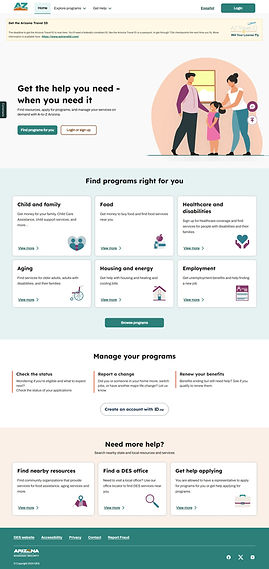
Pictured above: AtoZ guest user home page
Role
UI/UX Lead
Functional Lead
Team
Rashmi Singh (UX Designer)
Saugandhika Kale (UX Designer)
Shiya Xiao (UX Designer)
Jennifer Kwack (UX Designer)


Pictured above: AtoZ dashboard and program browser.
The Challenge:
Building a one-stop shop for all Arizona benefits
For many Arizonans, accessing crucial support meant navigating a maze of outdated manual processes such as mailing forms, making repeated phone calls, or attending in-person interviews for every program. Most of the critical services offered no online alternative. Applicants found themselves re-entering the same details multiple times and waiting weeks for updates, often with no clear guidance or way to check their status.
These barriers fell hardest on those already facing challenges: families without reliable transport, non-English speakers, or residents with mobility issues who could not get to these appointments. Meanwhile, agency staff operated in silos, unable to share information or collaborate. The end result was a slow, disorganized, and frustrating experience for both users and administrators, underscoring the urgent need for a modern, integrated solution.
The Goal:
AtoZ set out to replace Arizona’s fragmented benefits landscape with a single, unified digital experience that places the needs of residents at the forefront and resolves key user pain-points. Rather than managing multiple applications and repeating the same details for different programs, Arizonans could now apply for, manage, and receive real-time updates on all their benefit programs in one place, all at once. AtoZ would use saved information to prepopulate future applications, provide a personalized dashboard, offer a mobile-friendly design, offer multilingual support, and offer clear guidance at every step. AtoZ aimed to ensure that support is accessible, timely, and easy to understand. This would remove barriers for individuals and families when they need help the most.
By connecting programs and integrating data across agencies, the platform aimed to not only streamline access but also support a more responsive and dignified safety net. Arizonans would be empowered to track their status, upload documents, report changes, and stay informed without confusion or delays to give them more control and clarity over their journey to well-being, and allow support to reach those who need it faster and more reliably than ever before.


Pictured above: program explorer, instructions page, basic info page
The Process:
The path to the A-to-Z Arizona Client Portal was distinguished by cross-agency collaboration, agile delivery, and an unwavering focus on user needs. From day one, project teams brought together both state leadership and Deloitte management, designers, and developers in visioning workshops, which translated shared ambition into a stepwise roadmap for an integrated benefits experience.
Central to the early stages of design was a series of user interviews and workshops that unearthed user pain points, such as repetitive paperwork, lost documents, and a lack of real-time help. These insights shaped initial features like a unified application, robust document management, and a dynamic dashboard. The AtoZ portal's document management system was designed to let users easily upload, review, and reuse supporting documents across multiple benefit applications. Documents uploaded for one program could be securely referenced for others, eliminating the need for repetitive submissions and reducing paperwork bottlenecks.
Design and development unfolded in fast-paced, agile sprints, combining design thinking with technical best practices. User journeys were modeled and iterated in Figma; development took place in Salesforce Lightning, ensuring flexibility and scalability. To further reduce friction, a chatbot was embedded in the portal, ready 24/7 to answer common questions, guide users through next steps, and escalate issues to live support when needed. Alongside this, a personalized to-do list feature was added: users receive clear, proactive reminders for upcoming deadlines, required documents, and renewal notices right from their portal dashboard. Automated notifications and a centralized message inbox make it easy for residents to stay organized and one step ahead, minimizing missed opportunities to complete their applications.
Teams met regularly for sprint planning and stakeholder reviews, with new features prioritized based on impact and user feedback, continuously gathered through built-in survey prompts and analytics. Rigorous accessibility testing and multilingual design remained top priorities. During each sprint, agency partners and frontline staff contributed to user acceptance testing, helping ensure real-world readiness for launch and transition. Since going live, continuous monitoring and ongoing feedback drive enhancements—ensuring that document handling, chatbot responses, and to-do list notifications remain responsive to the evolving needs of the people of Arizona.


Pictured above: document manager, message inbox, user preferences
The Solution
The A-to-Z Arizona Client Portal delivers a unified, user-centered benefits experience by allowing residents to complete a single application that automatically populates information across multiple programs. This eliminates the burden of repetitive paperwork and ensures that critical details are accurately carried through renewals and new applications. A secure, centralized dashboard gives users a clear view of all their benefit programs, application statuses, document requests, and approaching deadlines, making the entire process transparent and easy to navigate.
Integrated document management enables users to upload, review, and reuse important forms across programs, while personalized to-do lists and automated reminders help them stay ahead of required tasks and renewals. The portal’s real-time status updates, multilingual support, and mobile-ready design further enhance accessibility, ensuring every Arizonan can manage their benefits on their own terms. A responsive help system, including a 24/7 chatbot, is always available to answer questions or offer guidance, making support both immediate and dependable.

Pictured above: guest home page, signed-in user dashboard
The Impact
The launch of the A-to-Z Arizona Client Portal delivered tangible improvements in the way residents access and manage state benefits. Application processing times for key programs were reduced by 30%, as users could now apply for multiple services through a single, streamlined platform in just 15-20 minutes, down from one hour or more using legacy systems. Over 70% of users completed document uploads on their first attempt, thanks to intuitive upload workflows and clear guidance on required materials, while automated reminders and personalized to-do lists drove a 40% increase in on-time renewals and change submissions. The mobile-friendly design and multilingual support expanded access, resulting in a 55% growth in applications from rural and non-English-speaking communities within the first six months.
User satisfaction soared, with post-launch surveys indicating that 82% of respondents found the portal easier to navigate and more transparent than previous methods. Centralized messaging, real-time status tracking, and simplified change reporting reduced help desk inquiries by 25%, freeing up staff resources for higher-touch support. By empowering Arizonans to navigate benefits independently and efficiently, the portal helped streamline agency operations and delivered a digital experience that set a new standard for accessibility, responsiveness, and user empowerment across state government.
30%
Reduction in application processing times
55%
More applications submitted by AtoZ users
82%
Of users found the portal easier to use
Visit AtoZ
To visit AtoZ Arizona and get a feel for the improved user experience, visit atoz.az.gov. I encourage you to explore the site and create a free account for the full experience.
Read about my other projects

Coversate

Talend on Demand

Hispanic LatinX HCD